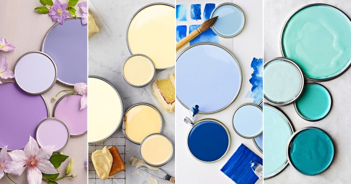
In case you’ve decided to repaint your home, you’ll be glad to find out that there’s nothing easier to do for your curb appeal than change the color! Another good news is that there are 11 timeless paint colors that will never go out of style!
For those of you about to hit Home Depot or Lowe’s (but maybe you should try Walmart first!), here are the 11 colors that will look good centuries from today:
1. Sage
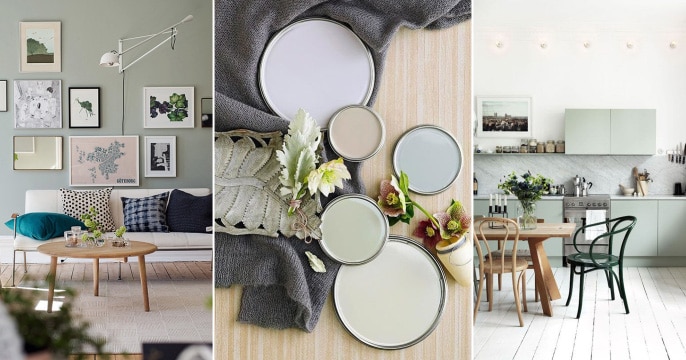
If you haven’t heard of this color by now, allows us to enlighten you! Sage is a combination of green and gray used in vintage homes and not only. You can paint your bathroom walls, the living room, your bedroom or any other room of the house this color and it will look amazing!
Another good thing about it is that it looks great even for exteriors, so go retouch that old entry door! If you’re using it inside your home but feel it’s too bland, there are a few other colors you can add to make things pop a little: try fuchsia, orange or yellow! We have a few examples just to give you an idea. What do you guys think?
2. Mint
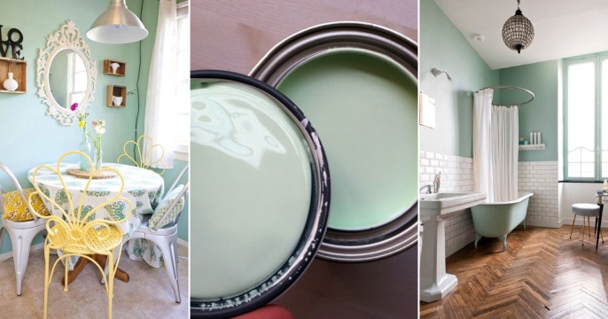
Doesn’t this color take you back to the 60’s? If it doesn’t, that’s alright! The reason mint is so popular is because of the composition: a tiny bit of green, some blue, a good chunk of white and a hint of yellow. A few decades ago this color was all the rage: you could’ve seen mint Lincoln cars driving home, every house had a mint colored refrigerator and stove and the girls were going nuts for mint dresses.
Today, turquoise is sort of taken over mint, but for homes and offices, mint is still the color to go with! Unfortunately, it’s not so good for your exterior unless you only paint your shutters and front door. Also, mint is a great color for a nursery: add pink for a little girl’s room and gray for a boy’s room and there you go!
3. Lavender
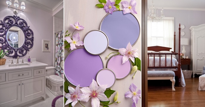
People seem to think that lavender is a very hard to deal with color. Well, that’s not true as long as you don’t go overboard with it. Apparently, lavender induces calmness and that’s why you’ll see most elderly homes painted this color. However, this doesn’t mean lavender can’t be a hip nuance!
You can tone down its perkiness by adding some gray or make it really pop next to a mahogany wooden floor! It’s not recommended for the exterior, so keep it inside! The best thing to do with lavender is to use it for your bathroom walls: this way, it will not feel overwhelming at all. But if you’re brave enough and lavender is your thing, feel free to paint every room this color!
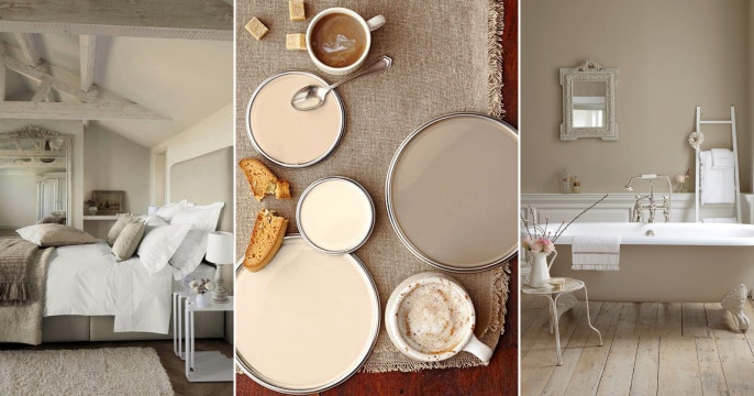
4. Oatmeal
If neutrals are your favorite, try oatmeal paint! It’s classy, elegant and it can be combined in numerous ways! Plus, it’s great for both interiors and exteriors! There are a few rules when using this nuance: always add some white to delimitate your space. Then, you can make it more feminine by adding pink and red, or more masculine with a touch of black, blue or green.
Oatmeal is great for kitchens, small spaces, staircases or pantries. You can use it for your nursery in case you’re going with a safari theme. Add a few tigers, lions and paint a tree in a corner and you’re all set!
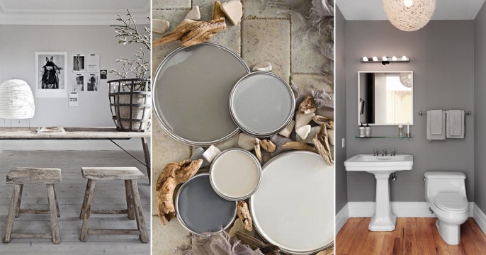
5. Ash Grey
Ash grey was a star color for home improvement a couple of years ago and there are many reasons for that: first of all, it’s a key ingredient in any modern house, it’s easy to combine it and it brings that European touch to every American home. Ash gray is a very soft kind of gray which can be used for both interior and exterior.
Also, don’t be afraid to make this color the focus point in your bedroom, nursery or bathroom. You can use ash gray as a base color and then add shades of pink and turquoise to make it pop. Some people think gray colors are too cold, but you can add oranges and reds to perk things up a little!
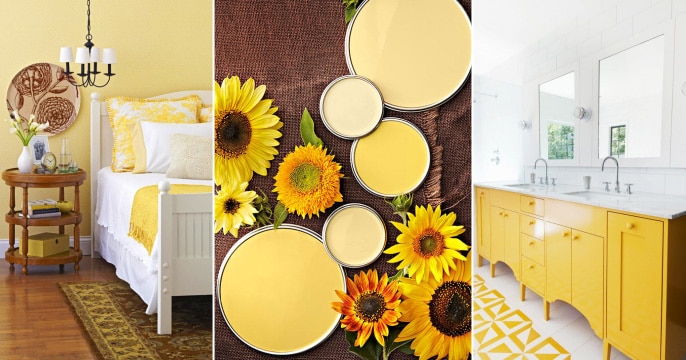
6. Honey
Nothing says summer like a delicious paint color! We are madly in love with this honey nuance that works wonders for any and every home out there. However, since it’s such a strong color, there are a few rules you need to keep in mind: only add small pops of color (blue, red, orange), combine it with neutrals and nothing else and never paint your whole house this color or you might get a headache!
Since honey is a combination of citrine and red-orange, the result can affect your optical nerves. This is why you should only paint a vanity this color, or your shutters and front door and that’s it! You can dilute it with some white and use it to paint one accent wall but no more than that! However, we still think it looks amazing: it’s like swimming into an ocean of honey!
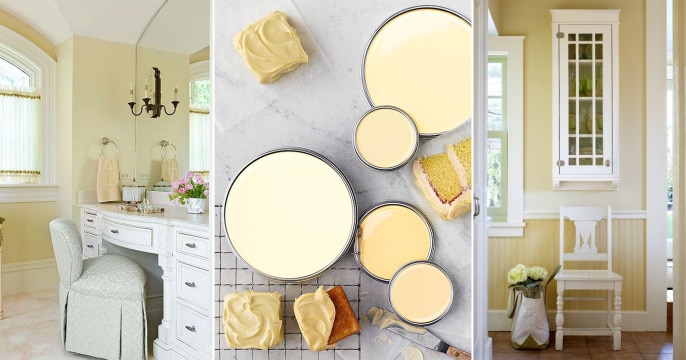
7. Buttercream
For those of you crazy about pastels, we have a yummy buttercream paint! It may look cool now, but a couple centuries ago it was just the way the white paint looked in an old room. Back when they didn’t have many choices in color, buttercream was really not something to wish for in your home!
Fortunately, technology and science have allowed us to really appreciate this unearthly nuance: perfect for both interiors and exteriors, buttercream is a very picky color since it’s pretty difficult to combine it. Here are the rules for that: go for soft greens, grays or dark blues in order to keep the buttercream’s appearance intact.
8. Aquamarine
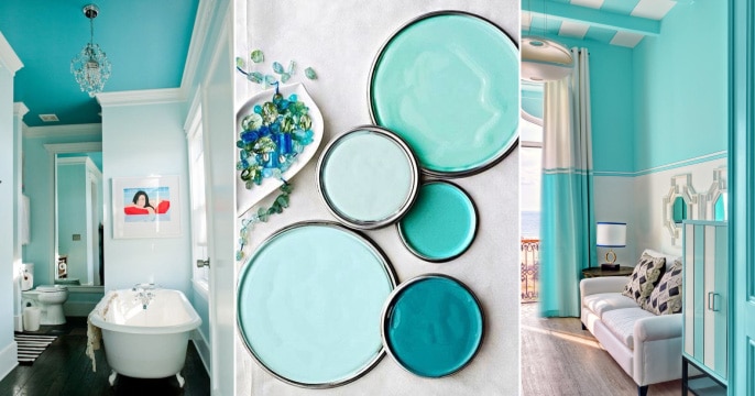
Aquamarine is the paint color you want to see when you’re in your hotel room, by the beach. The good news is that you can have it in your color too! Generally, people think aquamarine is too overbearing, but if you’re smart about it, it can be just right for your home!
However, try not to use this nuance for the exterior of your home since it’s very bright (which might work in the summer, but be a dread in the winter). If you live in Hawaii, however, there are no limitations: you can go aquamarine-crazy! A few tips: aquamarine goes beautifully with gray and blush. To tone it down, add some beige!
9. Blush
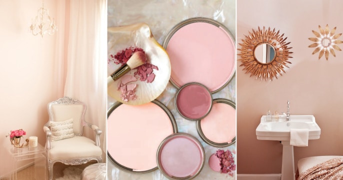
Before you say anything, this color doesn’t have to be girly if you don’t want it! Expectant mothers choose it for their daughters’ nurseries, but it can very well be used to spice up a bedroom, for example. Plus, mint and blush have the same history: they were both born during the 60’s and continue to bring back memories of long-lost cars and movie theaters.
We honestly don’t think there is a way to make this color look more masculine no matter what you might add, so let’s just let the ladies handle this. Blush should only be used indoors and with moderation: an accent wall, a fancy bathroom, and a few pillows on a gray couch but no more than that!
10. Teal
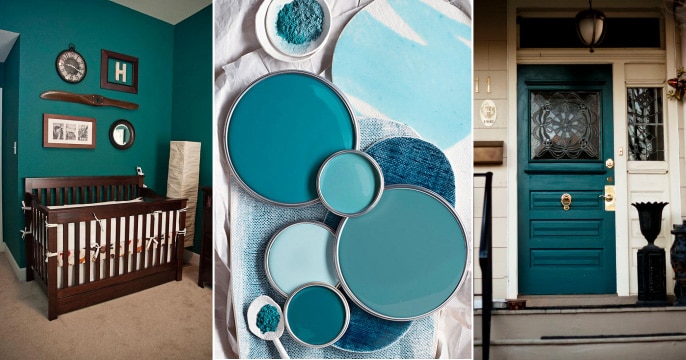
Here’s a strong color that would look good on anything, from evening gowns to entry doors! Its composition makes it easy for anyone to relate to it, man or woman, young or old. You can paint your living room walls this color and add white furniture for a posh look, for example. Or you could add pink pillows to create a more playful space! The possibilities are endless! We recommend that you use teal in your bathroom, living room or bedroom. It might be too cold for a kitchen, especially if it’s a small one.
11. Olive
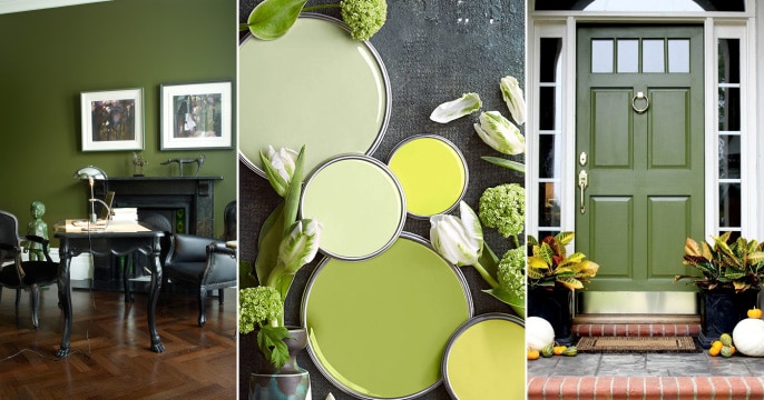
If you love Italian food and basil, this color was made for you! Plus, it looks so vintage it’s like moving into one of Agatha Christie’s novels! This color goes beautifully with retro furniture, whites, and blacks, a hint of yellow and some fuchsia here and there for contrast. It’s good for both interiors and exteriors, bathrooms, and living rooms, as long as you add some white to create depth. We have a few cool examples for you. Would you paint your walls this color?
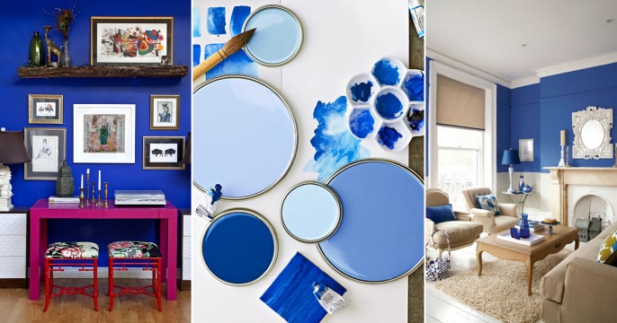
12. Royal Blue
Not everybody likes royal blue, but those who do are special people! Who can forget Kate Middleton’s engagement ring and that royal blue stone and dress? Royal blue is a very picky color which needs to be the center of attention. No combinations necessary, no need to tone things down or perk them up a bit! Royal blue is a star that doesn’t need backing vocals if you want.
Our favorite thing to do is paint one accent wall this color or all walls but from the center up, like in the pictures. Another fun fact: only combine royal blue with white! This is a great color for your living room, bathroom, bedroom, but too rich for a nursery. Babies need soft nuances to adjust their eyes, so don’t do more than a few pillows in this color. Other than that, go ahead: feel like a royal!
Which one of these timeless paint colors do you like best and what would you use it on?

